Logo Design & Brand Identity
Retro Relics, Group Museum Campaign
COLLEGE
Park University
ROLE
Senior Designer
EXPERTISE
Identity Design
YEAR
2024
Project description
This project was a collaborative effort undertaken during my senior semester at Park University, where I worked alongside two other experienced students. Our collective work culminated in a presentation to a major audience on the university's campus, with all necessary printouts and deliverables provided. I was responsible for the design and layout of the poster, ensuring meticulous alignment of both text and visual elements, creating a cohesive and professional composition that adhered to the project's design system. Additionally, I prioritized a customer-centric approach throughout the design process, ensuring the final outcome was not only visually appealing and user-friendly but also aligned with the project’s objectives and branding guidelines.
Timeline
The project was completed over the course of one month, from March to April, during which I efficiently coordinated all aspects of the design process, bringing the museum's campaign to life within a structured and timely framework.
Background
This project involved the creation of a distinct corporate identity and visual presence for the museum, drawing inspiration from vintage and old-school design aesthetics and video games. The objective was to develop a design that conveyed the museum's professionalism while aligning with its mission and engaging its audience. Throughout the process, I maintained consistent communication and collaboration to ensure that the final design was cohesive and fully aligned with the museum’s vision, resulting in a polished and impactful visual identity.
Process
This category details the step-by-step approach taken during the project, including research, planning, design process, development, and implementation phases.
Research & Planning
I conducted in-depth market research to understand the visual trends within the gaming industry, focusing on vintage 3D pixel art and classic game machines. This research allowed me to identify the preferences of the target audience, which were rooted in nostalgia for retro gaming culture. I defined the key visual elements and design features that would resonate with this audience, ensuring the campaign would capture the essence of both the gaming era and the brand’s core message.
Design Process
I designed and developed the brand's identity, incorporating elements of retro 3D pixel art and classic gaming visuals. I created detailed mockups and interactive prototypes that conveyed the nostalgia and playful nature of the brand. Through iterative refinement and expert feedback, I ensured the design was both visually striking and aligned with the brand's identity, making it both engaging and reflective of retro gaming culture.
Development & Implementation
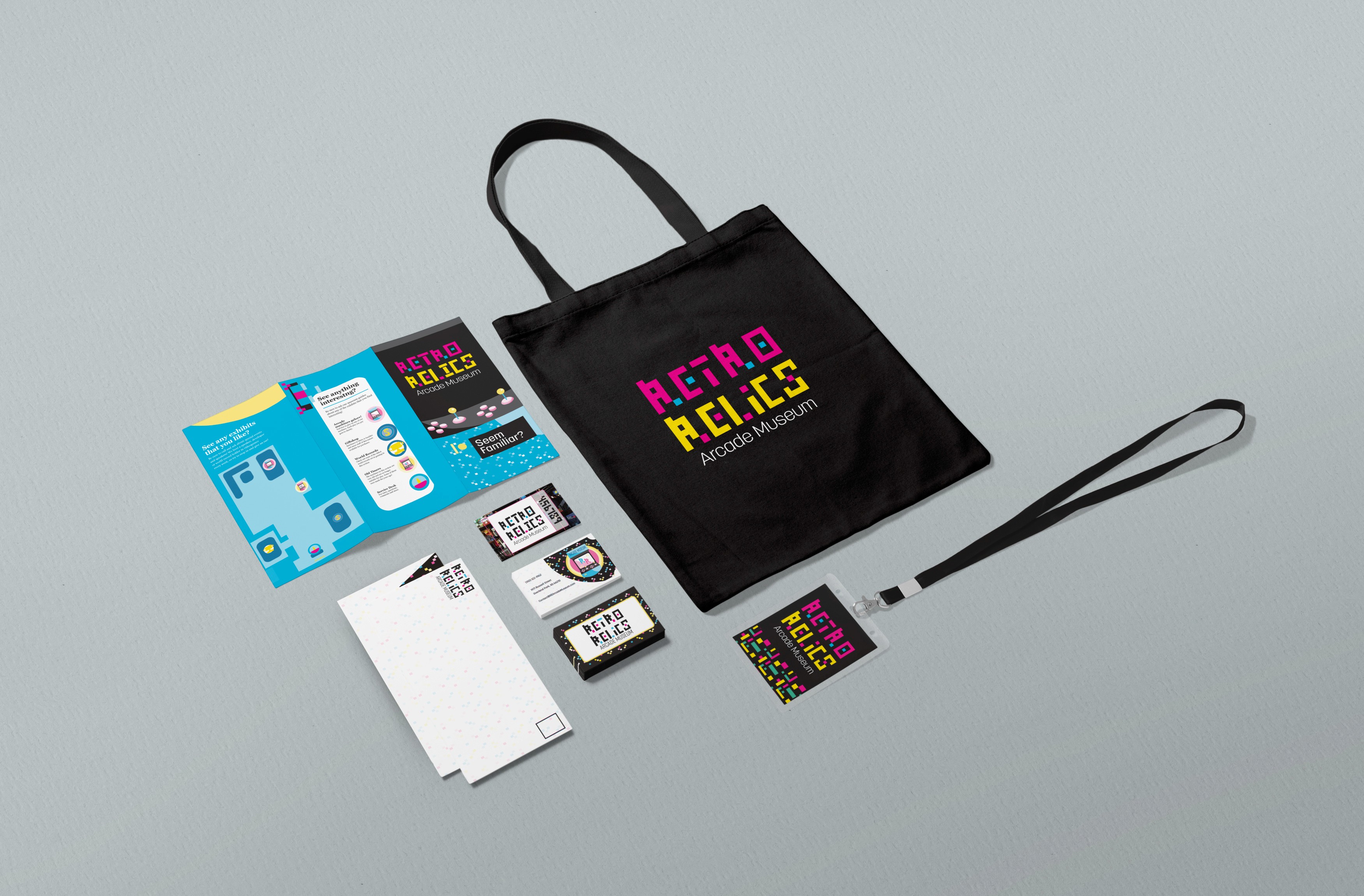
The final design was implemented across multiple platforms, ensuring visual consistency across digital and print mediums. I carefully prioritized design elements to maintain the authenticity of retro gaming while ensuring usability and brand cohesion. The project culminated in a dynamic, fully realized brand experience that resonated with its target audience and effectively communicated the Retro Relics’ nostalgic yet modern identity.
Solution
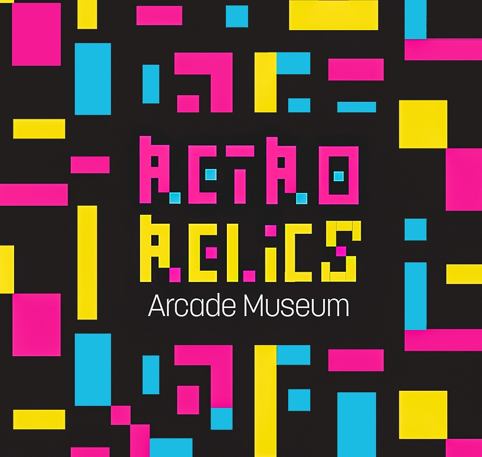
The brand's identity captures the spirit of vintage 3D pixel art and classic gaming, evoking nostalgia while appealing to modern gaming enthusiasts. It presents a playful, yet timeless image that connects with those who cherish the history of video games, building a strong sense of community and loyalty within the retro gaming culture. The design blends past and present, creating a unique, memorable brand presence.
Brand Identity Strengthening
The logo and cohesive design for Retro Relics establish a unique connection to the golden age of gaming, blending vintage 3D pixel art with modern sensibilities. The use of vibrant yellow and pink, colors widely associated with retro games and vintage aesthetics, enhances brand recognition while building a sense of nostalgia and trust within the gaming community.
Visual Consistency
A unified visual identity was meticulously crafted and applied across both digital and physical platforms, ensuring a consistent and engaging brand experience. The primary colors of yellow and pink, along with pixel-inspired designs, effectively reflect Retro Relics’ values of nostalgia, creativity, and the rich history of video games.
Market Positioning
The carefully developed logo and branding position Retro Relics as a standout in the retro gaming sector. By celebrating the charm of classic video games with bold yellow and pink hues, the brand establishes itself as an authentic leader in the market, appealing to both vintage enthusiasts and new generations of gamers.

Results
Here, the outcomes and achievements of the project are highlighted, including user feedback, adoption rates, and industry recognition.
Increased Brand Recognition
The new logo and visual identity significantly boosted 'Retro Relics’ presence in the retro gaming market, fostering a deeper connection with its target audience. The vibrant yellow and pink colors, paired with the pixel-inspired design, heightened the brand’s visibility and made it instantly recognizable within the gaming community.
Positive User Feedback
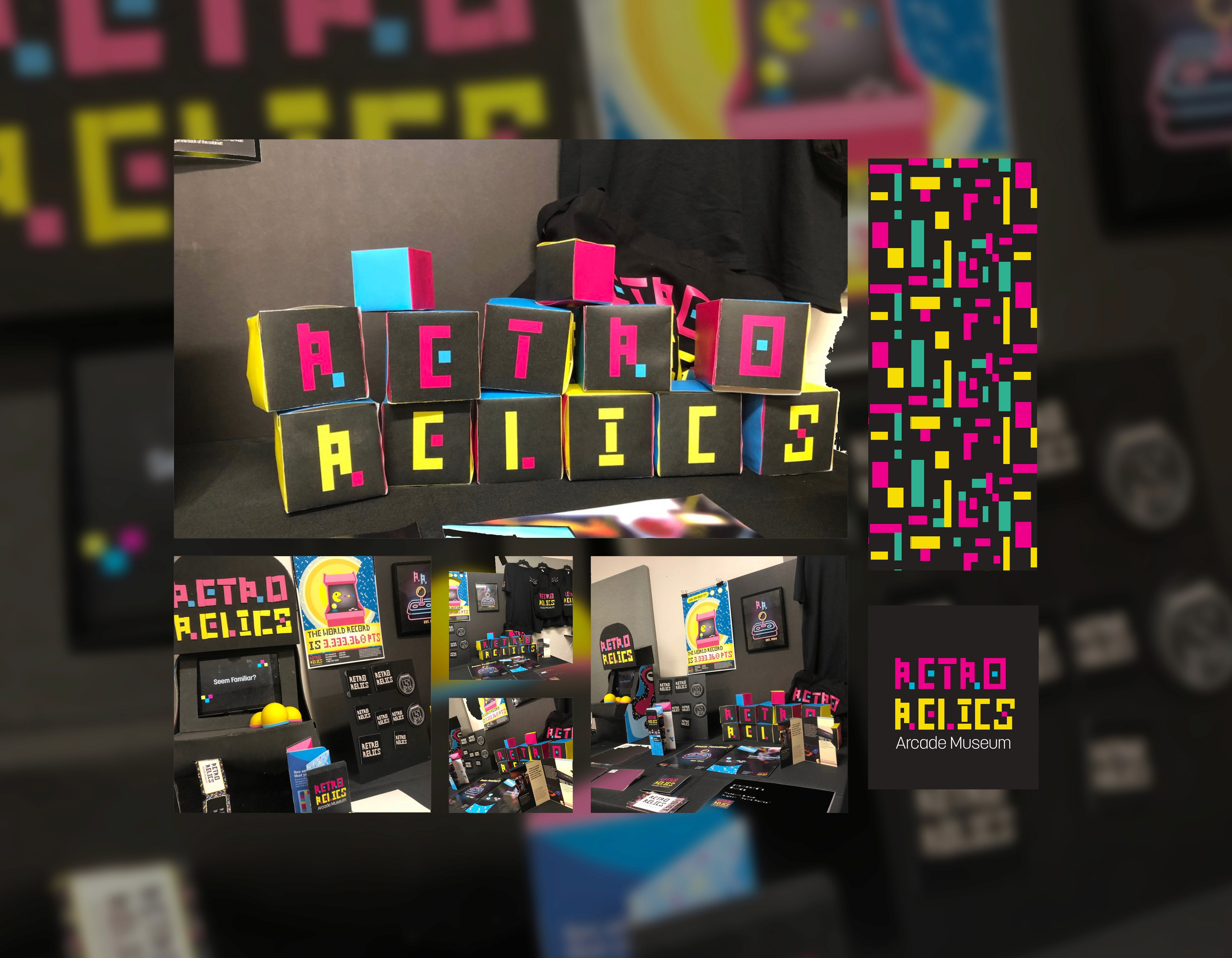
The design garnered positive feedback at the exhibition, with attendees praising its nostalgic and playful aesthetics. Many expressed their appreciation for the brand’s authentic representation of retro gaming. The instructor even commended the project, naming it the second-best among four presented, particularly admiring the attention to detail in the printouts.
Growing Market Interest
At the exhibition, Retro Relics was celebrated as an engaging and successful brand, sparking significant interest from visitors and potential buyers. The striking design not only captured attention but also cultivated a growing sense of enthusiasm for the brand, positioning it as a go-to choice for fans of vintage gaming culture. Additionally, other students were highly engaged with what was showcased at the stand, further validating the project’s appeal and impact.